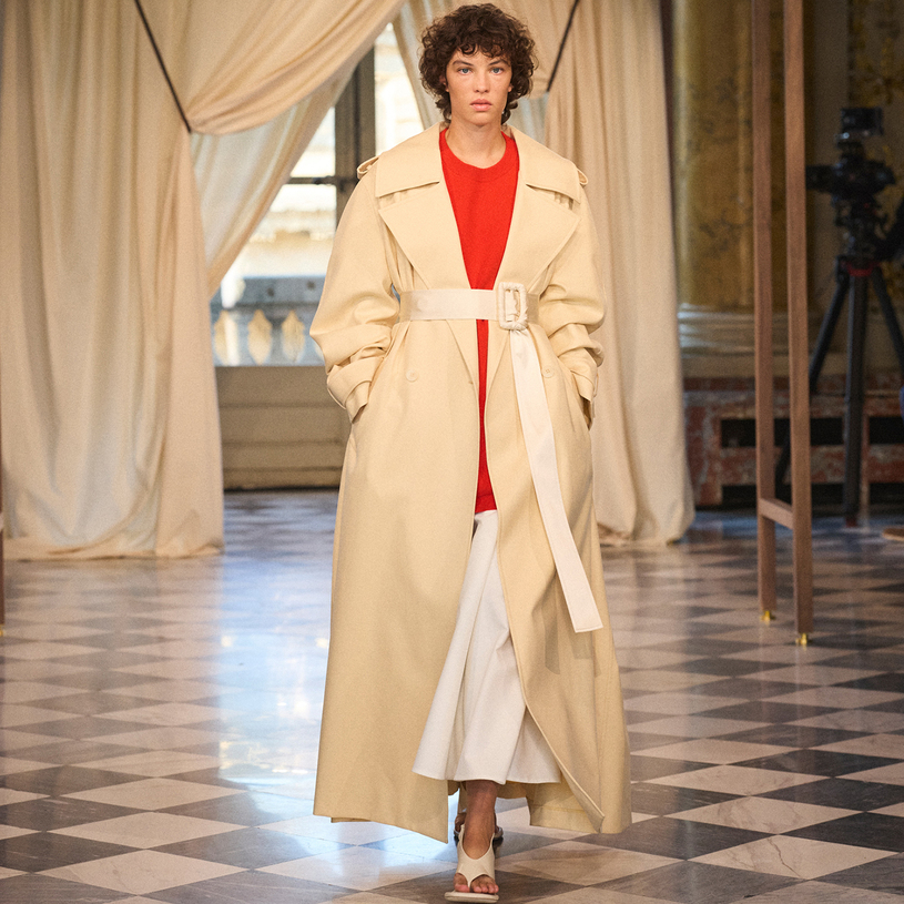
Following the exploration starting from "home" in the previous season, ICICLE Zihe introduces a new perspective with the 2026 Spring/Summer Workshop Collection "Outside the Window". The collection's designs revolve around the imagery of the "window" - it symbolizes the passage that connects the inside and outside, and creates an unbroken and boundless space. Each silhouette delicately captures the dialogue between the line structure and the lightweight form. The garments flutter, blend, and undulate, creating a transparent and dynamic wardrobe.
Under the conception of Creative Director Bénédicte Laloux, the Spring/Summer collection of this season features flowing natural materials, capturing the traces of the gentle breeze. The fabrics have a ripple-like texture, and the shape is formed by the material as it interacts with the air. Inspired by simple geometric patterns, the shaping of volume is reflected in the construction of windows, exploring the minimalist essence of rectangles, circles and squares. Draped folds, gathered folds and pleated folds keep the silhouette constantly in a state of transformation and movement.
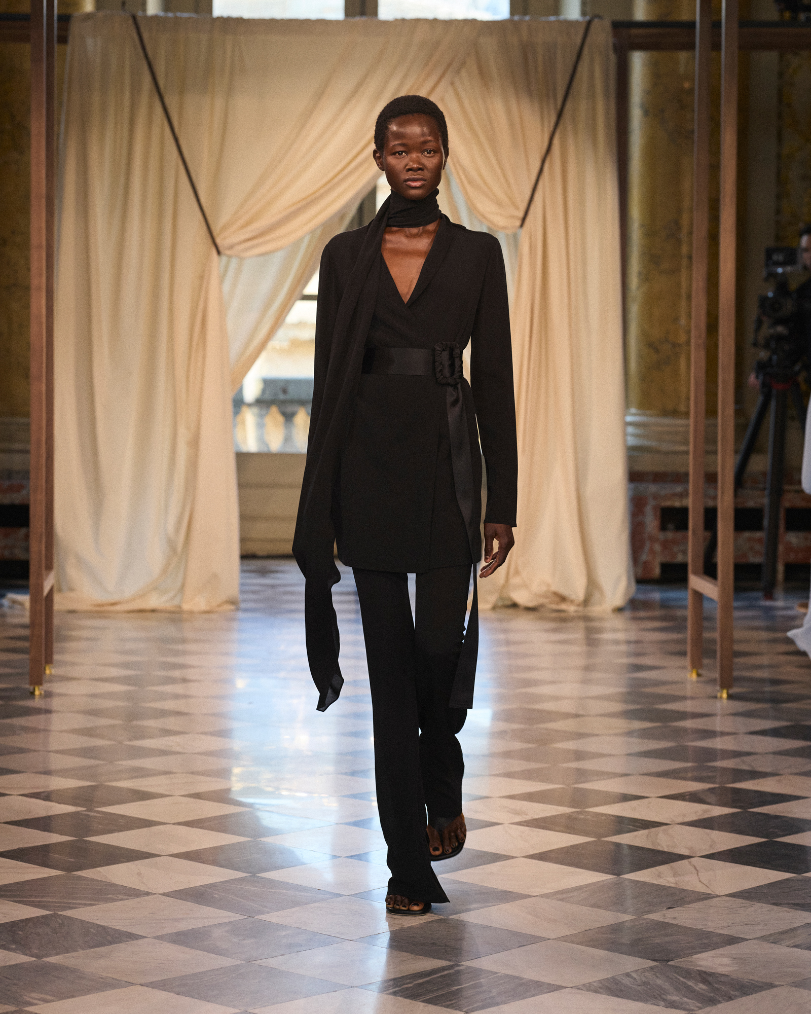
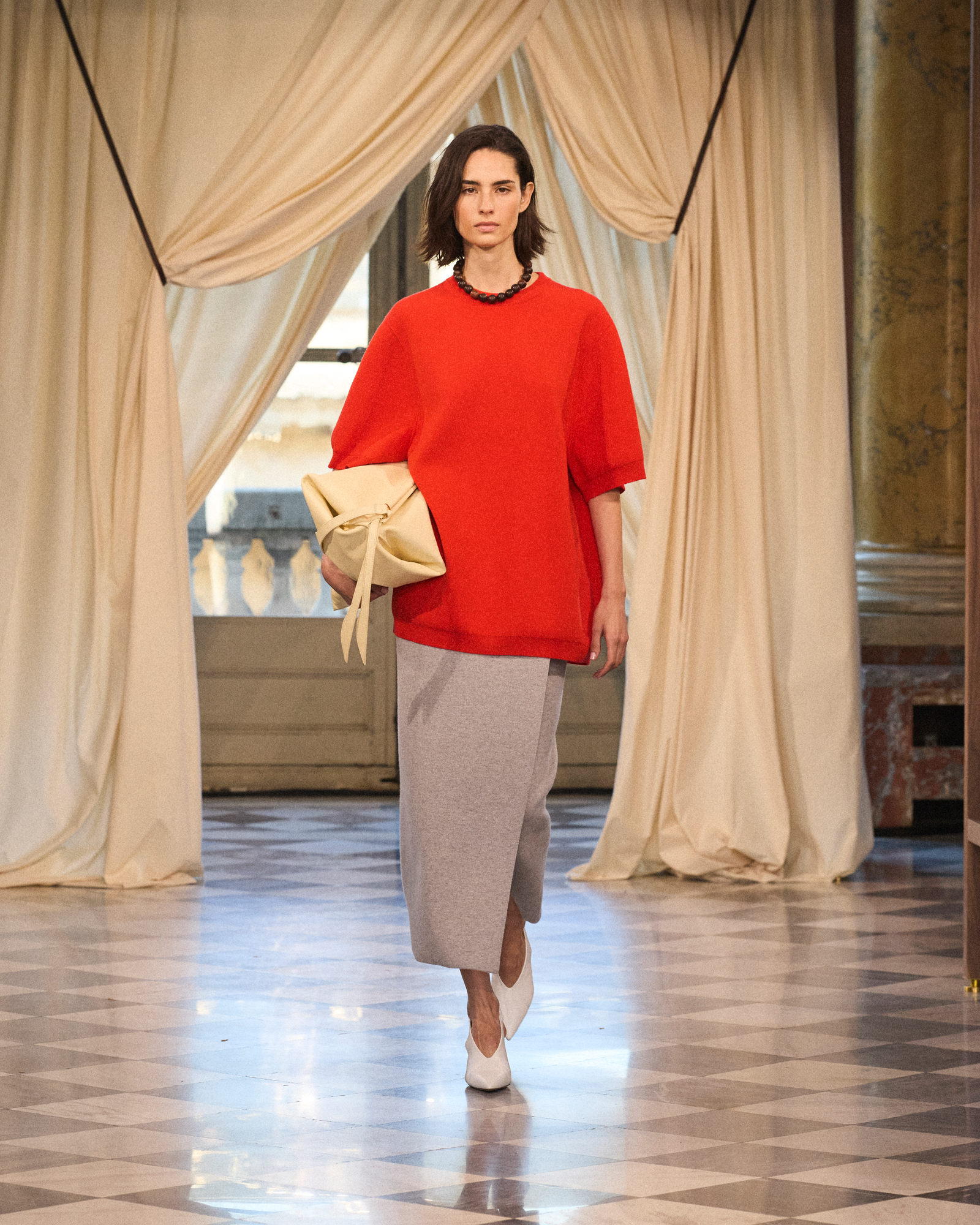
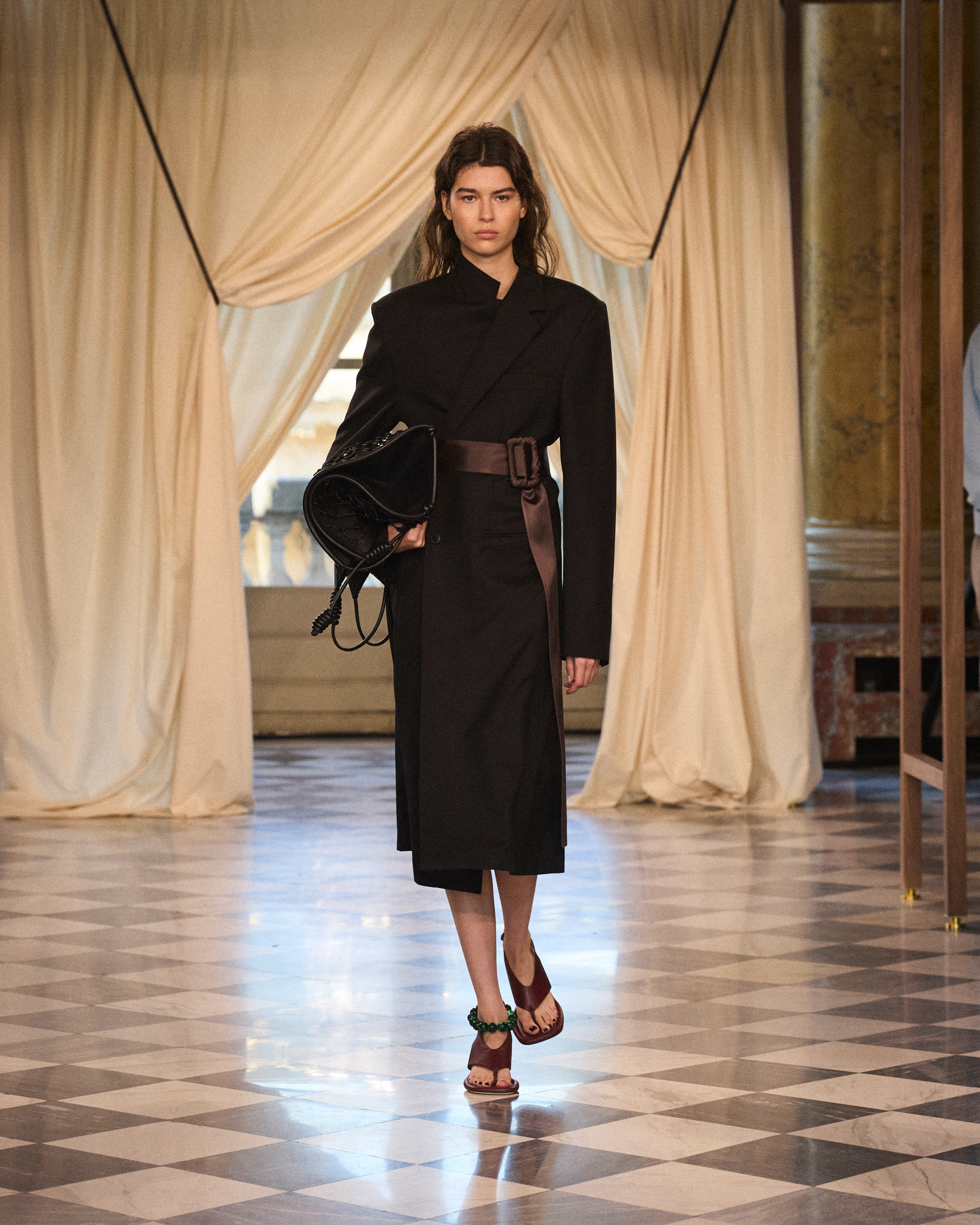
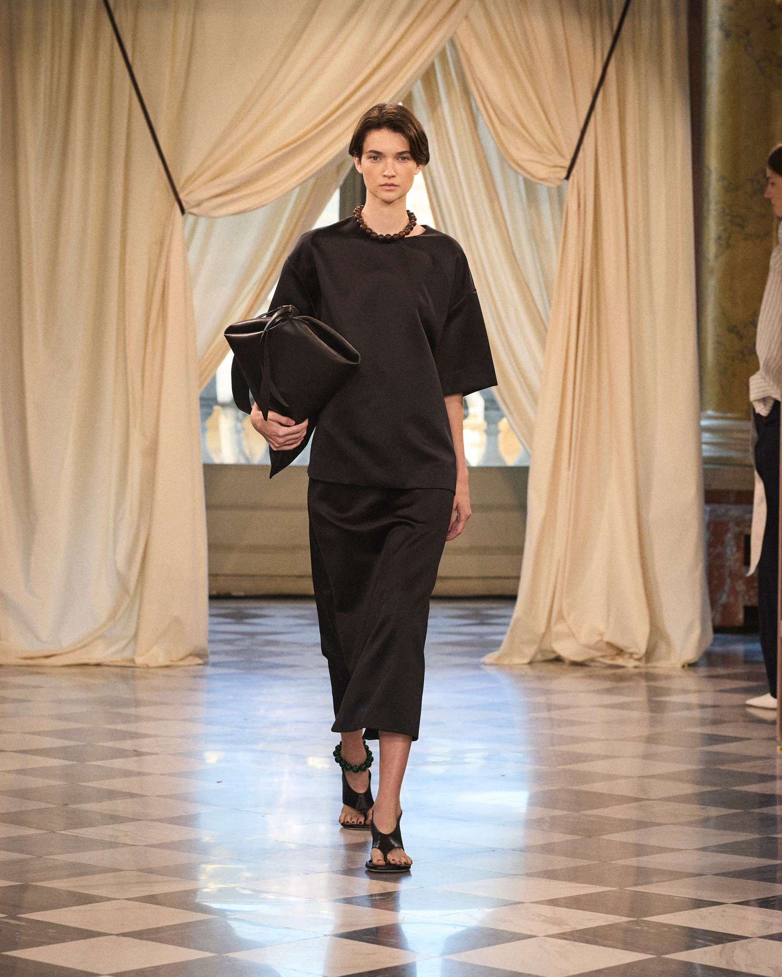
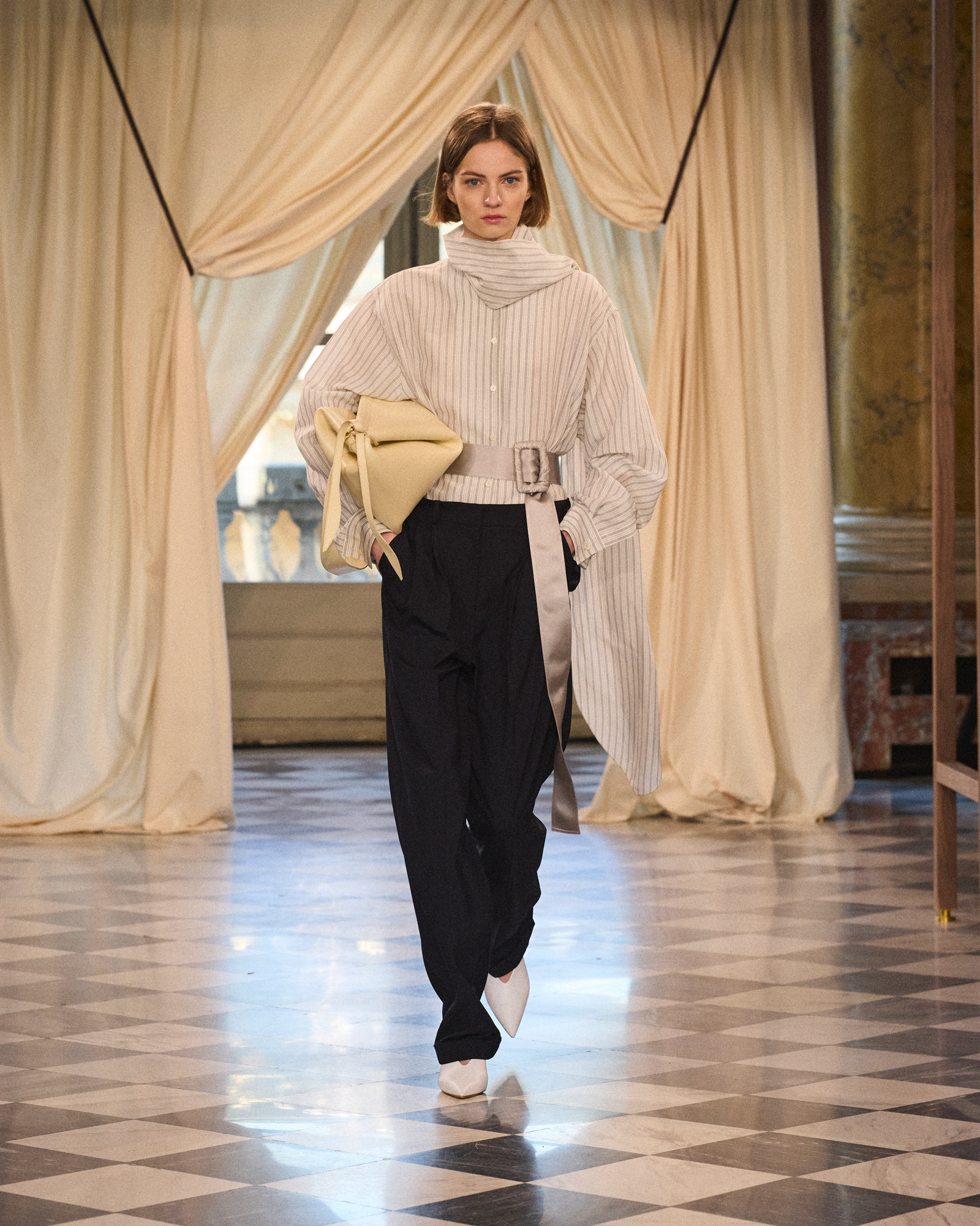
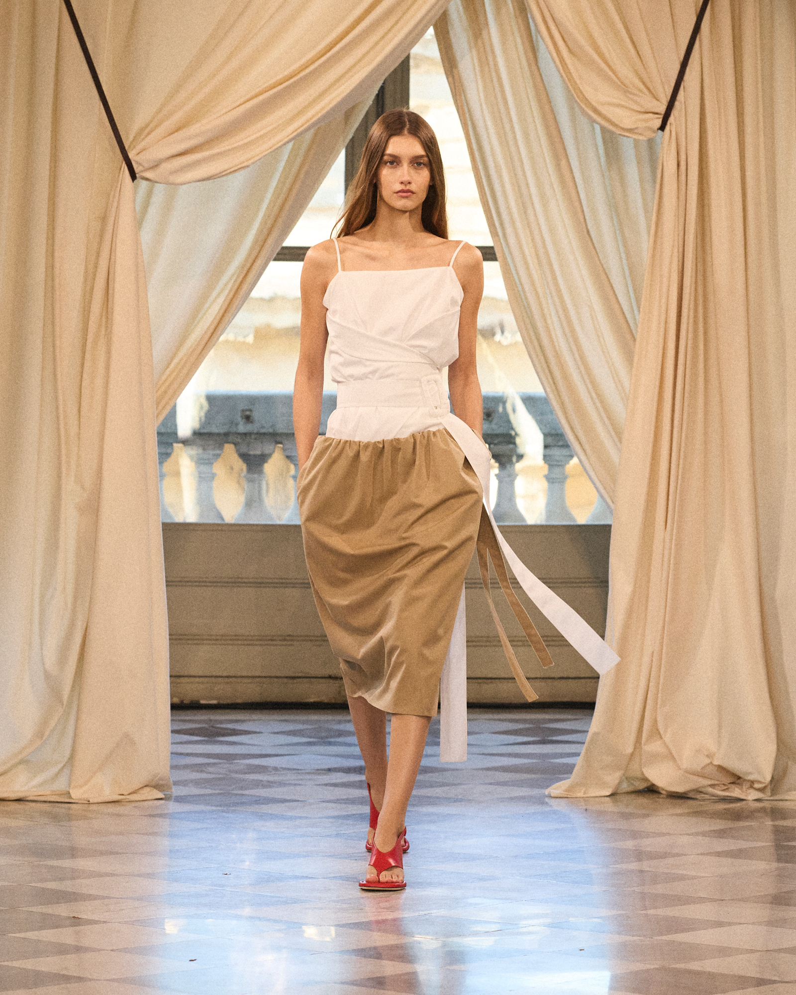
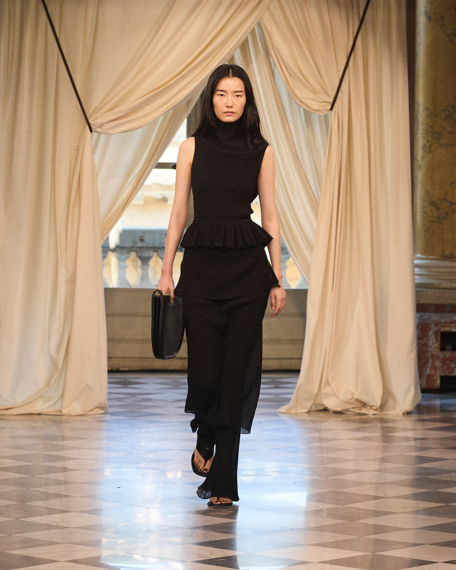
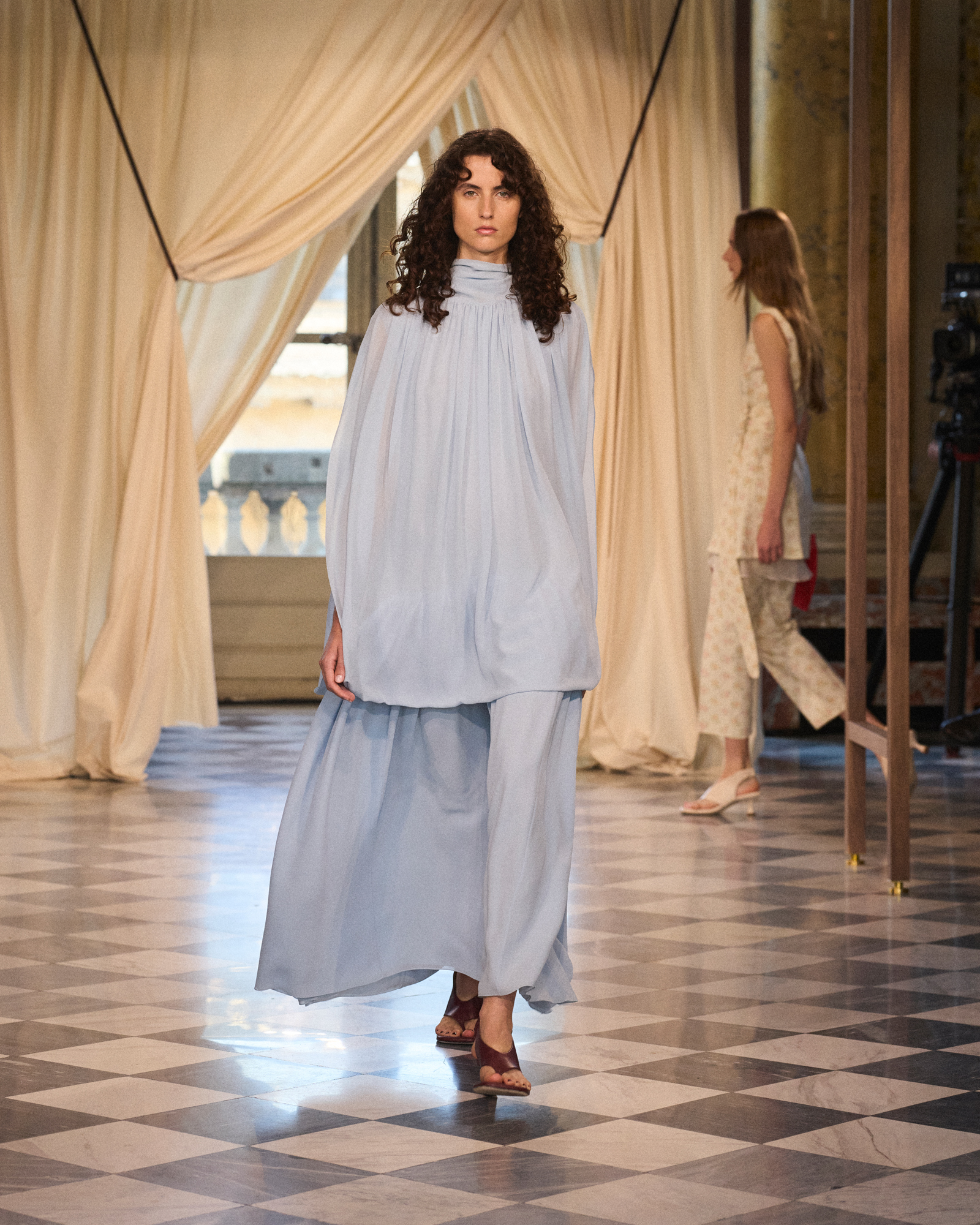
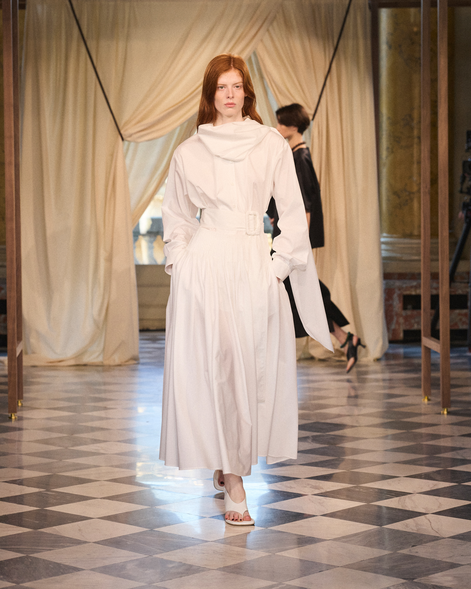
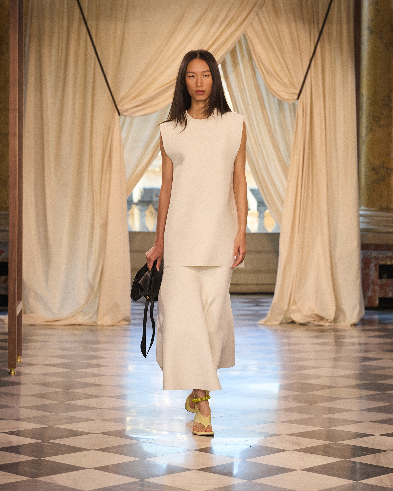
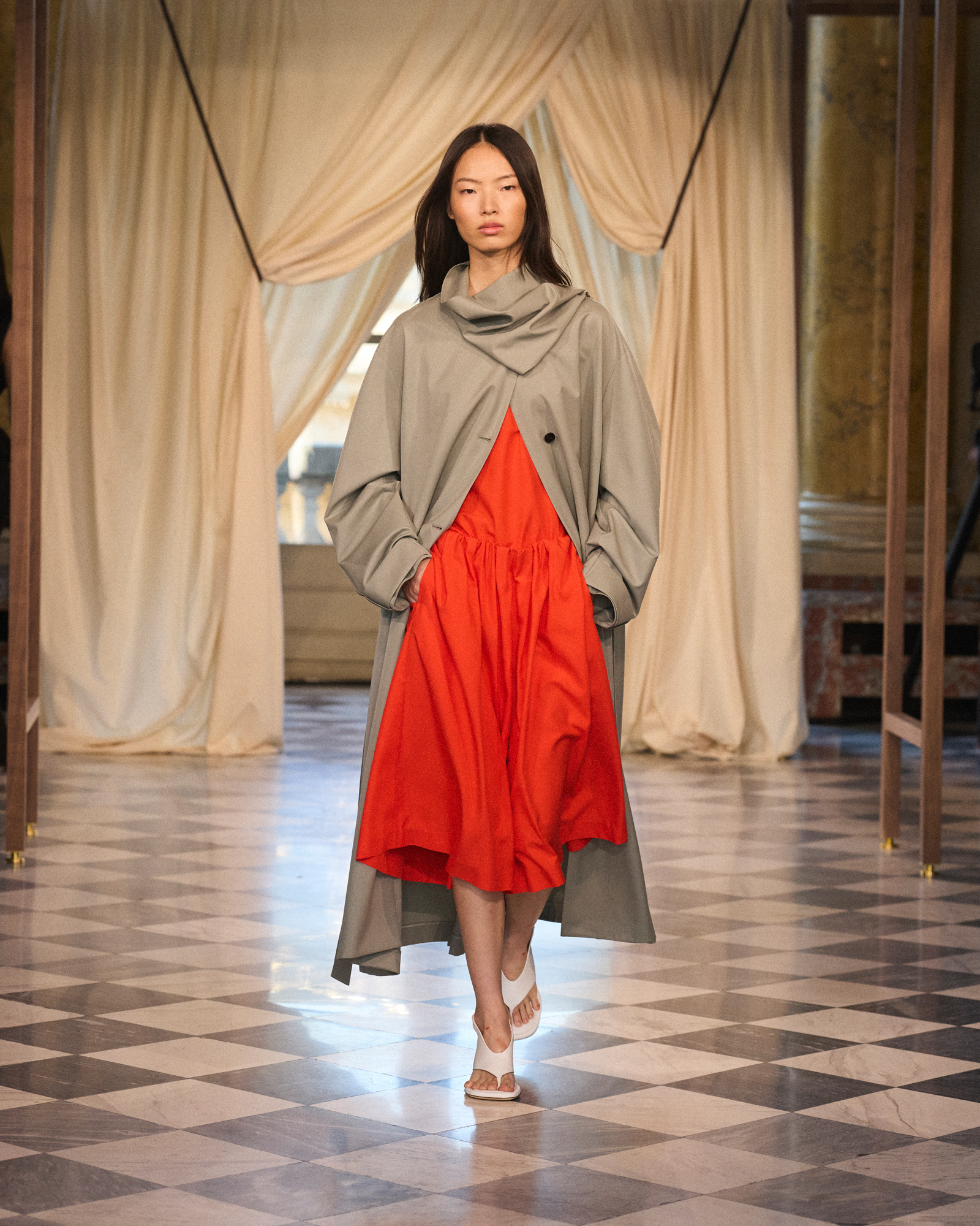
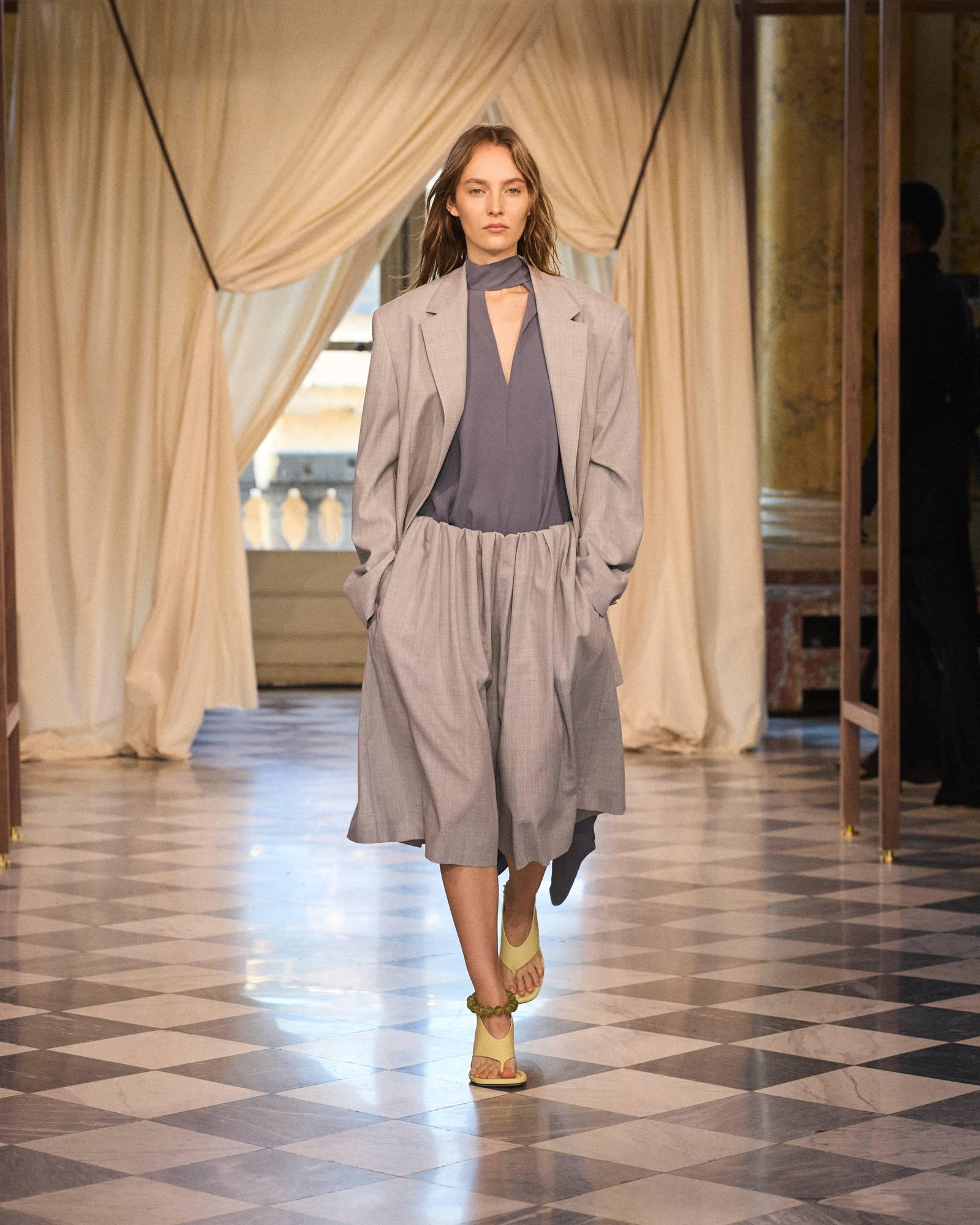
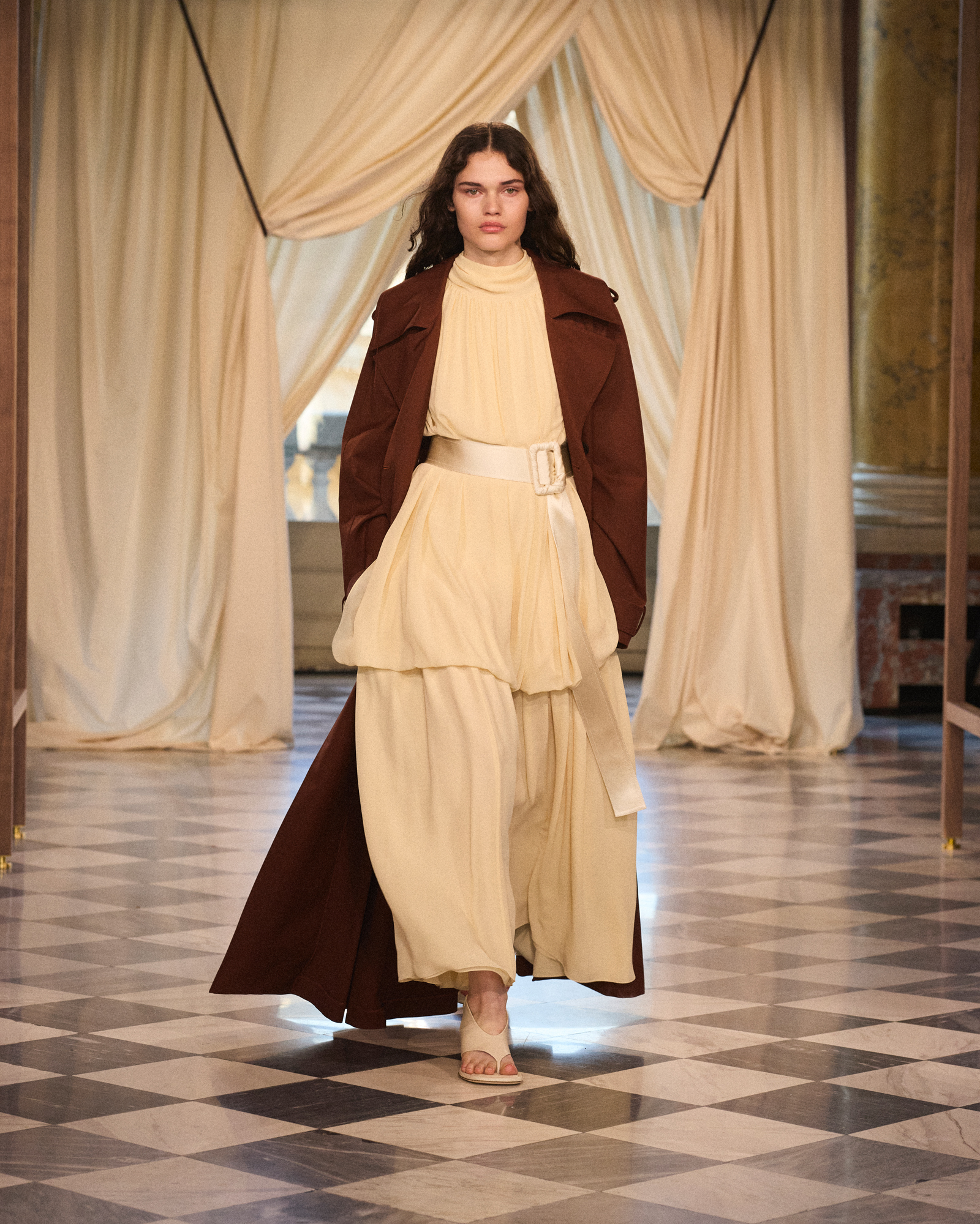
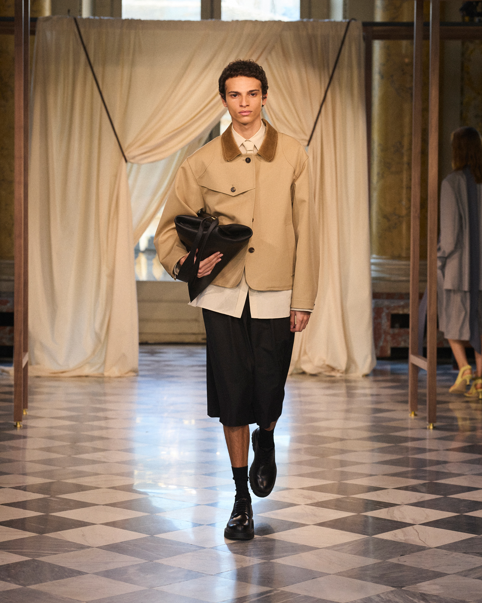
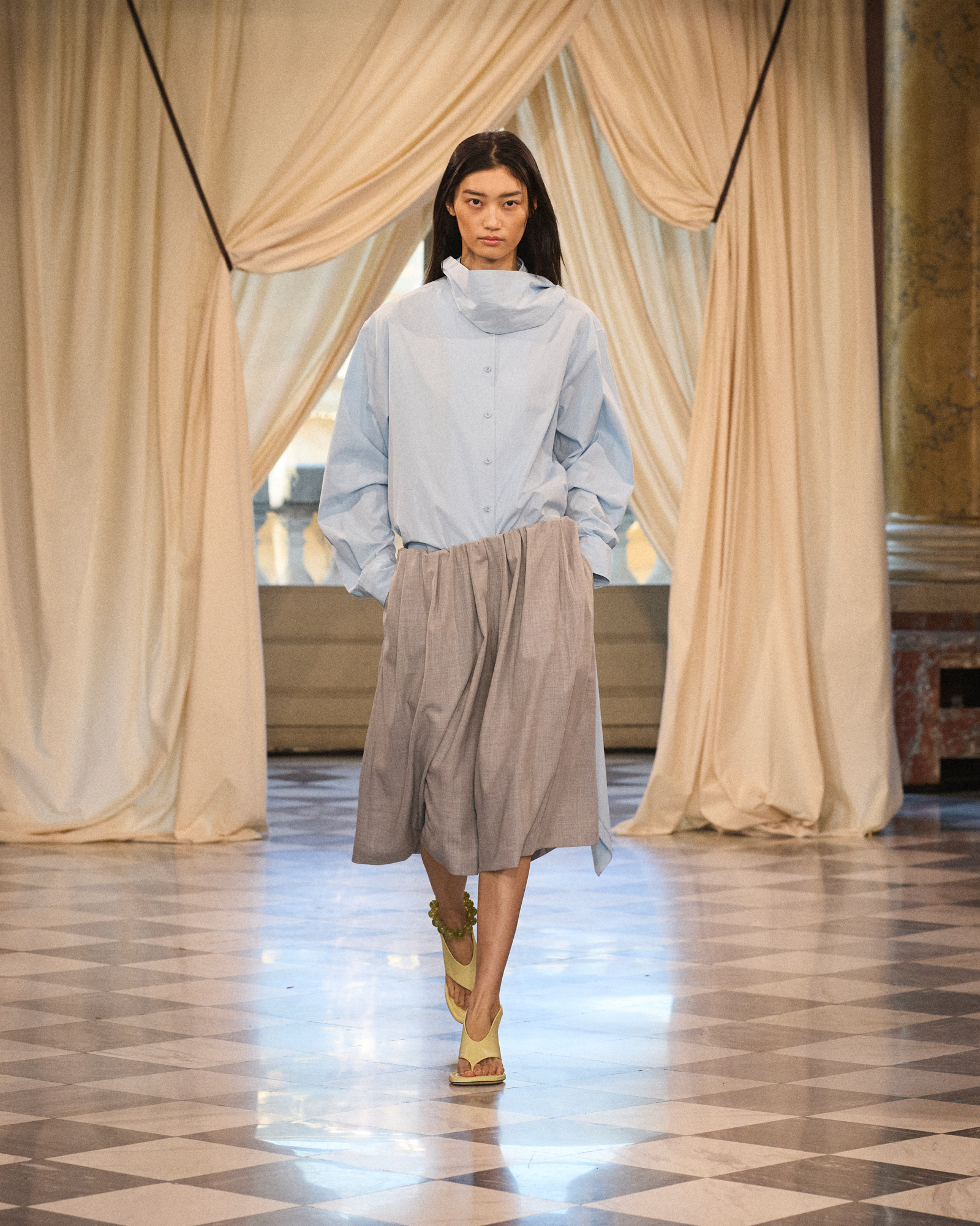
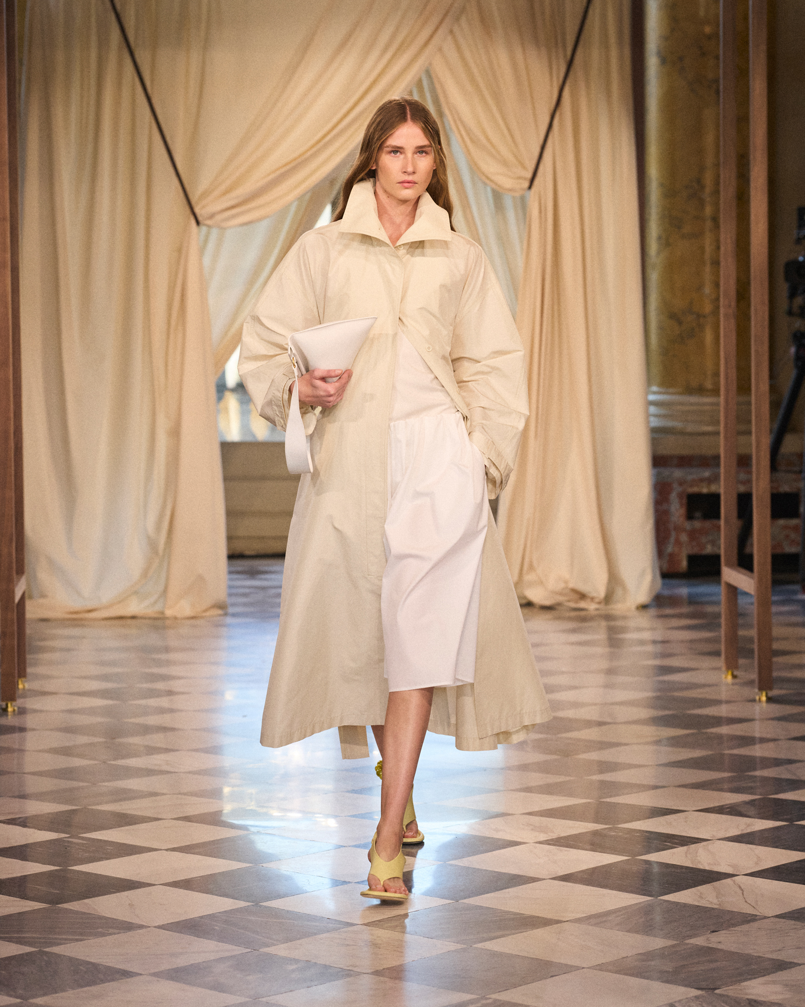
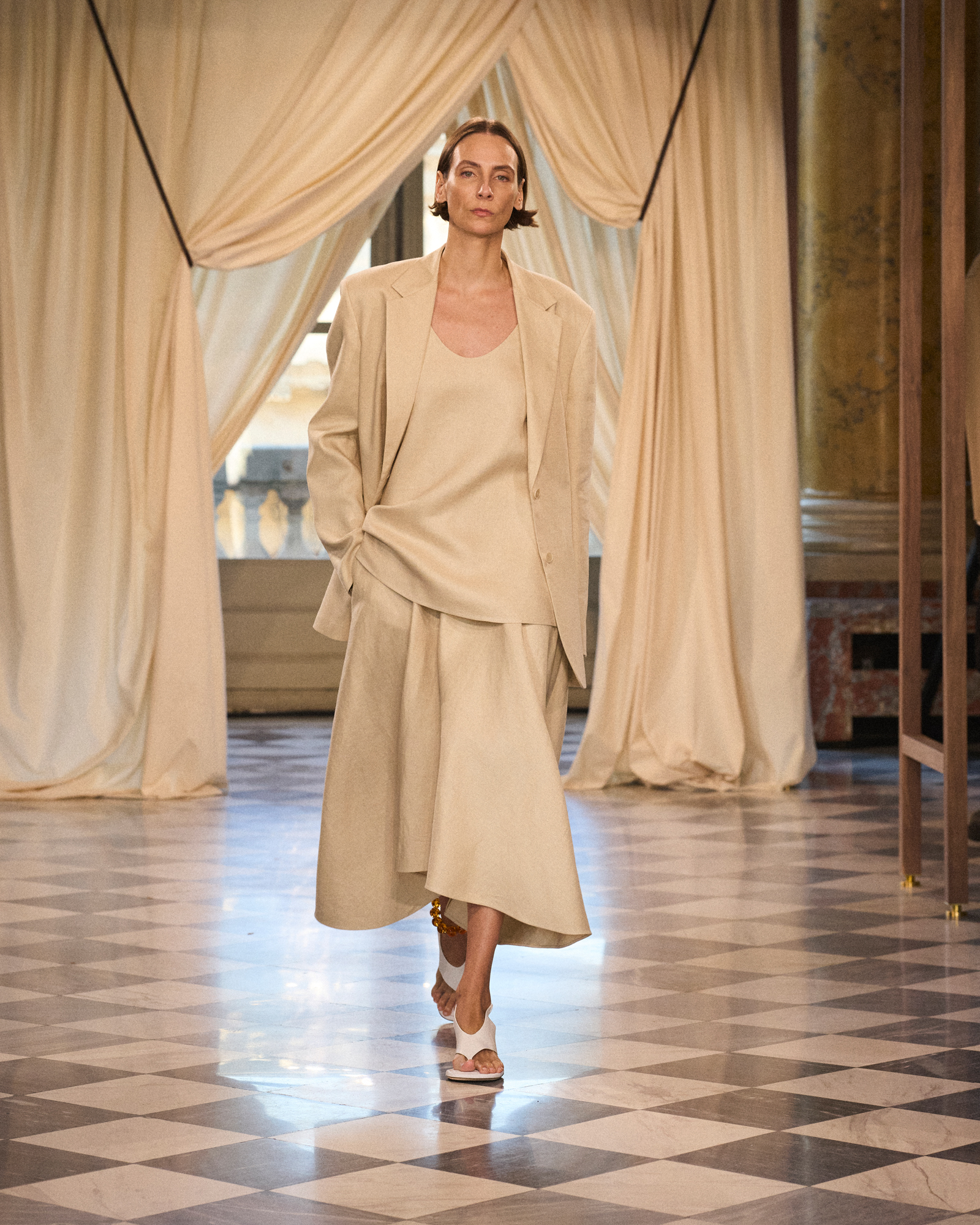
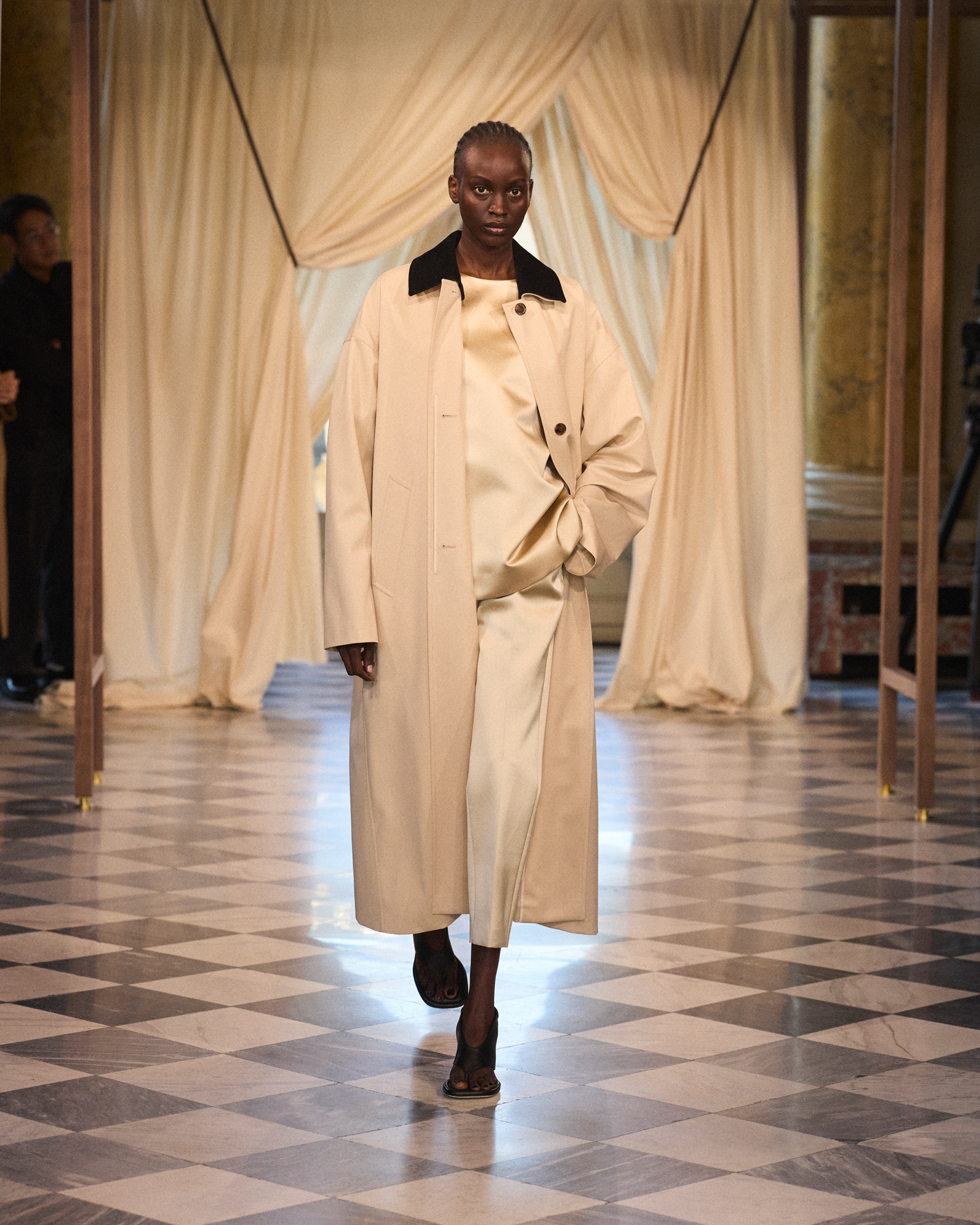
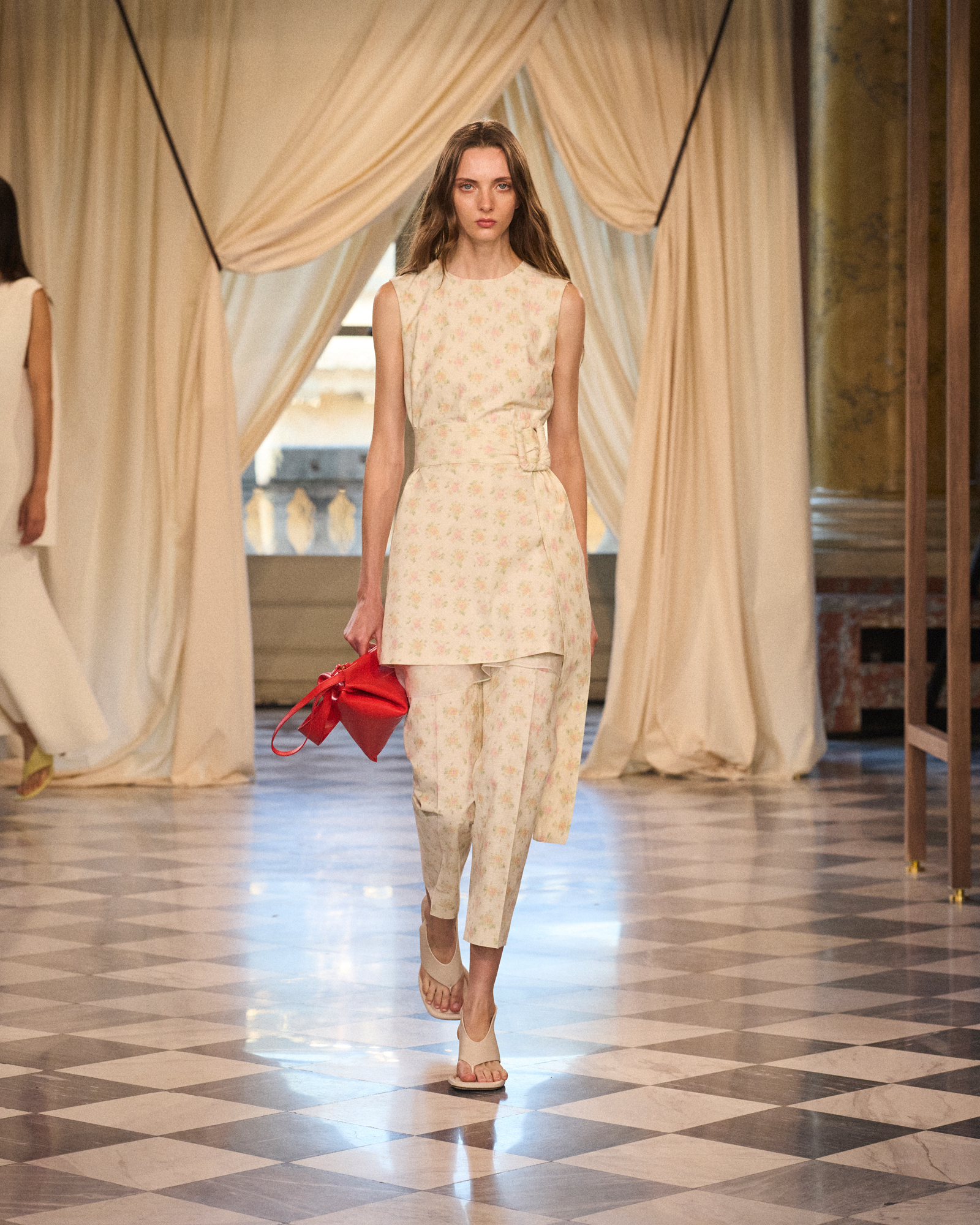
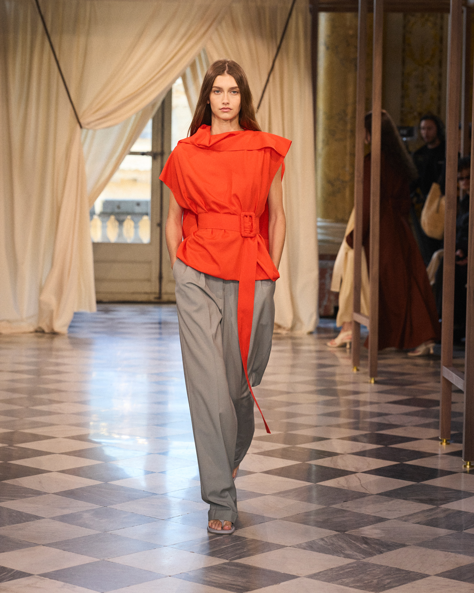
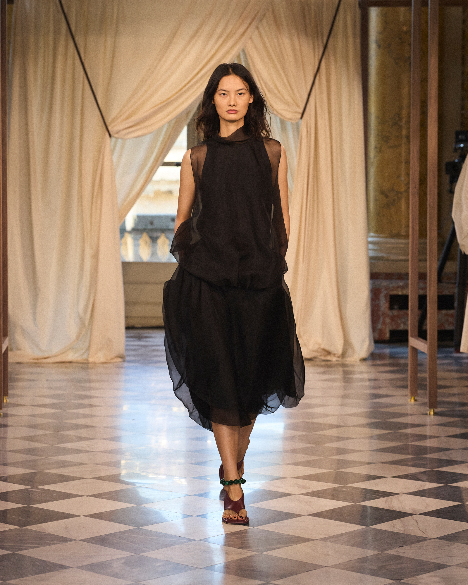
The fabric is like a curtain decorating the window, opening and closing in a paper-folded manner. Traditional elements of Hanfu echo subtly between the T-shaped silhouette and the flowing belt, infusing the minimalist wardrobe with liveliness and harmony. The series places particular emphasis on the collar design, which not only constructs the shape but also adds layers, enhancing volume and breathing sensation.
Natural materials interact with light in a harmonious way - satin silk, cotton poplin, and stretch crepe silk capture the flow of light; the Yunzhu silk, dyed with tannin and catalyzed by river mud, presents the mysterious luster passed down through the ages. Here, the lightweight wool suit explores a more stable and three-dimensional sensory expression, with occasional glimmers of light; elsewhere, the double-sided linen vividly interprets the dense texture of the fabric. Ultimately, a sense of transparency between the real and the virtual is presented in the organza.
This season's color palette is derived from the subtle gradations and tones of natural elements. From the lustrous white to the soft beige, cream yellow to grayish brown, camel to dark brown, along with orange, gray, and the emerald-greenish blue, interspersed with turquoise. In the midst of this harmonious palette, a bold red bursts forth like an exclamation mark, illuminating the entire collection.
By looking out of the "window", ICICLE has created a poetic series, praising the qualities of fluidity, transparency and balance. In this contemporary and timeless wardrobe, each piece is like a window, opening up a new perspective.
The Five-Colored View of ICICLE's禾 (Huo) Tree
Since its establishment in Shanghai in 1997, ICICLE ZHIHOU has always been based on Eastern philosophy, dedicated to promoting fashion that combines humanistic care and ecological sustainability, with the traditional Chinese five-color system serving as its foundation.
At ICICLE, color is not merely decoration; it is also language, narrative and harmony. The brand draws inspiration from the traditional Chinese five-color system - red, yellow, blue, white, and black - to create a visual realm, where each shade of color embodies the philosophy of harmony between heaven and humanity.
"The Five Colors" belong to a much broader system of interrelated and symbiotic ideas. This integrated concept that links fashion, culture and philosophy corresponds to the concept of the Five Elements (Metal, Wood, Water, Fire, Earth). This Five Element system was formed approximately 2,400 years ago (in the 4th century BC), and these elemental forces successively flow, governing the cycle of life and revealing the laws of the movement of all things, the alternation of the four seasons, and the transformation of flavors and qi. Thus, the Five Colors are also interconnected with seasons, music, taste, qi, and even the human organs and all living beings. Each color carries a network of connections that is full of dynamic balance and interrelatedness, linking together an infinite transforming whole.
When this evolving philosophical perspective is incorporated into the visual and clothing series, the narrative of ICICLE thus gains cultural connotations and imagination. This theory nourishes the brand philosophy: to dwell in the world in a way that empathizes with everything. In Chinese traditional wisdom, these symbols are like time and space coordinates, guiding humanity to position itself and resonate with the world. For ICICLE, clothing is not just a form or fabric; it is also shelter. Each silhouette has tranquility and composure.
The theory of the Five Elements reveals the interrelationships of the elements, including their mutual generation and inhibition. The transformation between them maintains the balance and the principle of making the best use of things, eventually merging into a unified whole - reaching the state of harmony between man and nature. For ICICLE, this pursuit of the unity of body, mind, nature and space naturally gives rise to an ecological concept of environmental consciousness. This is not a posture or an elaborate planning, but nature: only a fashion that maintains balance with the world can achieve reverence for nature and sustainable inheritance.
Through the concept of "five colors", ICICLE praises natural materials and the inspired color palette derived from the essence of nature. Adhering to the aesthetic principle of simplicity and elegance, its style focuses on balance and moderation, presenting a contemporary expression of ancient wisdom.
In the "Outside the Window" collection launch of the 2026 spring-summer season, ICICLE transformed this vision into a visual journey of color and geometry, creating a unique sensory experience. Starting with the "Five Colors" exhibition as a guide, ICICLE depicted a journey from west to east - it is both a geographical route and a quest at the spiritual and philosophical levels - the five colors here become five windows, reshaping our perception of time and space. At the center of the exhibition, a device made of natural walnut wood and constructed using ancient mortise-and-tenon craftsmanship connects the five color images, creating a unique space that combines the exhibition area and the performance stage.
Regarding the Five Colors
White is the color of gold, represents autumn, is located in the west, corresponds to the lung organ and the pungent flavor, and symbolizes the White Tiger.
Cyan is associated with wood, represents spring, is located in the east, corresponds to the liver and sour taste, and symbolizes the Blue Dragon.
Black belongs to the element of water, represents winter, is located in the north, corresponds to the kidney organ, has a salty flavor, and symbolizes the Black Tortoise.
Red is associated with fire, belongs to summer, is located in the south, corresponds to the heart and bitter taste, and symbolizes Zhenque.
Yellow, belonging to the element of earth, corresponds to the season of summer, represents the transition between the four seasons, is located in the center, corresponds to the spleen and sweet taste, and symbolizes the Yellow Dragon.
Regarding mortise and tenon construction
Mandarin-Oriented Jointing, as a traditional Chinese wooden construction technique, has its origins dating back over 7,000 years to the Hemudu Culture in Zhejiang Province. From palaces and temples to pavilions and towers, as an invisible framework, it endows ancient Chinese architecture with the vitality of breathing and stretching, remaining standing as new even after many years. This technique has no nails or glue; it entirely relies on the precise interlocking of components, testing the extraordinary skills of the craftsmen and carrying profound Eastern philosophy: true power cannot be forcibly obtained, but stems from the harmony of all things. The wooden structure installation created in this exhibition is designed in a modular style. After the exhibition, it will be completely disassembled and moved to the Paris store and exhibition hall for continued use.
Etymology Explanation
Screw: Refers to the head of the screw, the protruding part of a wooden component that is used for connection.
Mao: Refers to the hole, which is a slot used to receive and secure the tenon.
The mortise and tenon fit together, supporting each other - achieving balance, precision, and mutual dependence and complementarity.
On the symbolic level, the mortise represents initiative, giving and seeking;
Bozhu symbolizes reception, inclusiveness and containment.
This is a metaphor for achieving harmony through natural compatibility -
This spirit provides ICICLE with endless inspiration.